a spark, a flame, a fire
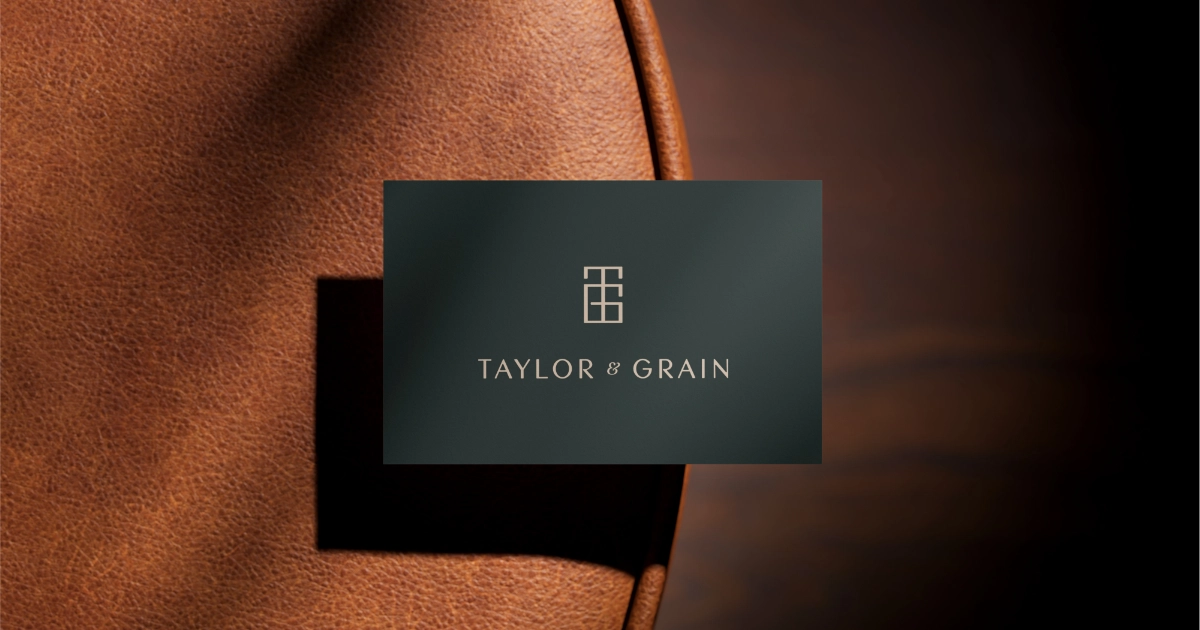
Logo and Branding for Taylor & Grain
A minimalist logo design and brand identity for a small Manchester based bespoke furniture business.
What Zoe Needed
A brand identity that would elevate the established business and position Taylor and Grain as an affordable luxury brand in the Fitted Furniture market. The brief required a contemporary yet classic look that gave a sense of high quality, skilled craftsmanship and luxury.
How I helped
Concept development, Logo Design, Colour palette, Typography,

Logo design
The logo draws inspiration from traditional maker's marks, symbolizing quality and craftsmanship. It features a monogram that echoes the elegance and structure of bespoke furniture.

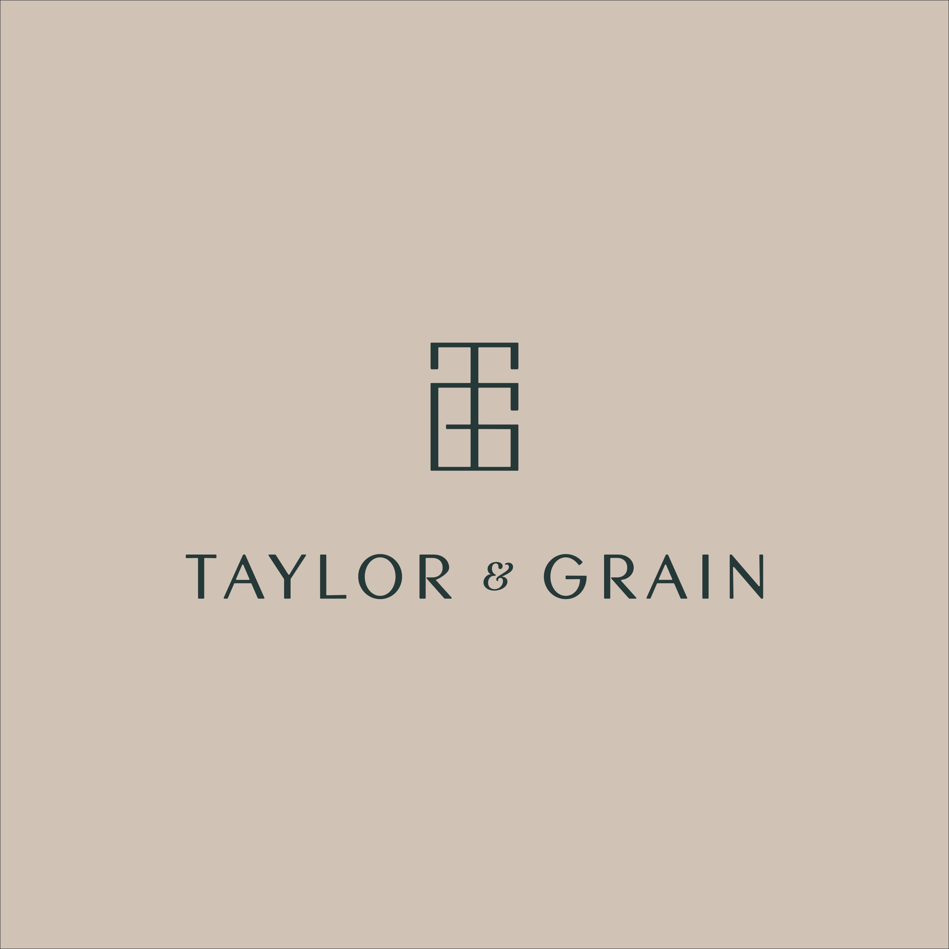
Identity
The Taylor and Grain Identity focuses on the feeling of high quality, classic aesthetics and contemprary design. The colour palette sets a tone of luxury and confidence through the use of a rich teal combined with a pale, sawdust tone. The design imbues the brand with a sense of the high quality that is to be associated with the company and its products.