a spark, a flame, a fire

"The logo is a mixture on three elements. First the shape of the brain references art therapy and mindfulness, second the shape of a paint palette alludes to art itself and third, a speech bubble represents the idea of community and communication."
Claire Howard Jewellery Branding and logo design.
A nature inspired brand identity for a Norfolk Jewellery Maker.
What Claire Needed
To take her brand to the next level and connect her visual identity with her products. The brief required a close look at what made her jewellery unique and rethink her positioning.
The original branding that Claire had had served its purpose in getting her so far. But the overall connection between her products, website, print and packaging wasn't quite as coherent as it needed to be.
Services
Concept development, Logo Design, Colour palette, Typography, Custom watercolour Illustration, Packaging design.
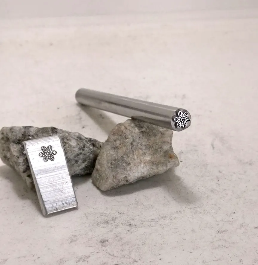
Logo design
The logo takes inspiration from the delicate, naturally inspired handmade jewellery that Claire loves to make. It's design was carefully considered so that it could be used as a metal punch for stamping Claire's jewellery. The flower and Jewel Motif work together to create a timeless logo with longevity and unique character.


The identity
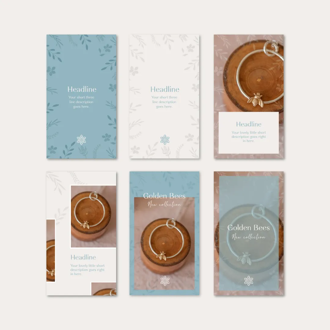
Along with the logo came the creation of a paired down colour palette that had the right look and feel of the coast where she works as well as a selection of a typeface that matched both the logo design and also reflected the values of the brand. This was all matched with custom watercolour illustrations that appear throughout packaging and social media.